IFComp 2015 review: Seeking Ataraxia

Seeking Ataraxia cover Seeking Ataraxia is a choice-based game that describes a couple of ordinary days in the life of a university student who suffers from OCD and anxiety.

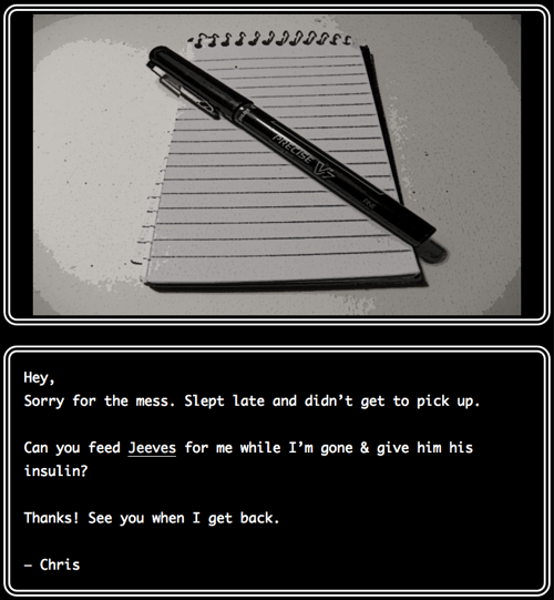
The game is a bit buggy and inconsistent in some details, for example the protagonist's apartment keeps reverting overnight from cleaner than it has ever been to total mess, the text talks about an alarm clock's digital display but the illustration shows an old mechanical wind-up clock, and so on. Nothing that couldn't be easily fixed afterwards.

There isn't any mentionable gameplay or plot, but the main goal of these slice-of-life games that describe mental health issues usually differs from other games. Instead of going for entertainment values or explosive action, the goal is often to provide peer support to others diagnosed with the same issues, personal therapy, raising awareness about the symptoms and consequences of mental illnesses, or any combination of them.

Seeking Ataraxia doesn't explicitly tell what its goals are. It's billed only as "a game about anxiety" but it seems to work quite effectively as public education. I certainly learned some things that I didn't previously know about e.g. how OCD can manifest itself. It describes the symptoms personally but neutrally, without preaching or overexplaining. It lets the readers come to their own conclusions about what kind of effect mental health issues have on the protagonist's life.

All passages are illustrated. Art style is consistent throughout.

All passages are illustrated. Art style is consistent throughout.

One problem with mental health issues is that it is often hard to realize that the symptoms might be due to illnesses instead of external causes or personal characteristics. The public service provided by games and other media that accurately represent mental health issues is that they can make people recognize the same symptoms in themselves and seek a diagnose.

It would be interesting to find some data on how effective games like Seeking Ataraxia and Depression Quest are in finding the audience that isn't already aware of the issues they're trying to raise. When a game is purely about the thing it advocates there's risk that it ends up preaching to the choir.

In the best case scenario there's a hook that makes the game attractive to the general audience even when the player don't necessarily actively want to learn about the subject matter. Coming up with such a hook is the hard part though: once you do play the game the effectiveness comes from the relatable everyday setting that would be lost if the plot involved some grand adventure. It might be exciting to play but the credibility of the message would be diminished the farther the plot would deviate from the audience's personal experiences.

IFComp 2015 mini-reviews

by Brendan Patrick Hennessy

Birdland is choice-based young adult fiction about a 14-year-old who, while attending a summer camp, sees strange dreams about birds. Soon the dreams and real world start to converge.

The game has many elements that I generally don't find very appealing, including teenage protagonists, dream sequences, summer camp setting, and almost purely metaphorical/surreal scenes. In less capable hands the outcome could have been disastrous but thanks to above-average writing and skillful game design the overall result manages to avoid most of the pitfalls. Anyone whose personal preferences do match the aforementioned elements should find this one a real treat.

by Moe Zilla

Forever Meow starts as a typical slice-of-cat-life simulator but quickly introduces a twist that averts the common trope. It's not purely the kind of feelgood game the genre dictates because there's a "serious" plot that involves real life-threatening stakes, but once the threat is resolved the ending has again a positive, even euphoric, tone. The story is well worth the 15 minutes it takes to play.

The interaction is slightly more fiddly than it should be. Nodes that advance without choice wait for a keypress but nodes with choices require choosing with mouse click. In practice playing requires having one hand on the keyboard and one hand on the mouse. It also effectively (and unnecessarily) prevents mobile play because there's no way to bring up the virtual keyboard.

by Andrew Schultz

Andrew is known for wordplay based games, but The Problems Compound is only pun-themed. The gameplay is mostly traditional parser IF puzzle solving.

Even though the plot is somewhat random and surreal, the wordplay theme serves as a common thread that gives justification to the otherwise seemingly disconnected elements. The story, characters and geography serve only as excuses to introduce the puns to the game. While the game isn't breaking any new ground, it's solid entertainment for the parser playing masses.

Disclosure: I beta-tested the game.

by Chandler Groover

This is not a review but rather a warning to other unsuspecting players: near the beginning of the game there is a scene that involves extreme animal cruelty, and the choice leading to it doesn't make the fact explicit. If you find the idea uncomfortable it's best to give this one a miss.

IFComp 2015 review: Capsule II – The 11th Sandman

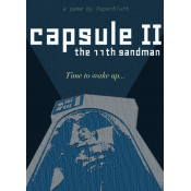
Capsule II cover Science fiction doesn't generally need to explain why its setting includes extraordinary technological advancements. Strong artificial intelligence? Sure. Interstellar travel? Naturally. Telepathy? Why not. The audience doesn't need convincing that such things exist. Science fiction's entire genre premise is imagining futuristic technology and its repercussions.

The trick to writing credible scifi is justifying the things it lacks. Take for example Dune: several thousand years into the future, humanity has regressed into a feudal society with relatively primitive technology. This is explained by the aftermath of a war against intelligent machines that caused a ban on artificial intelligence and advanced computing. They prefer melee weapons because shooting the ubiquitous energy shields will kill the shooter as well. Everything that doesn't fit the expectations of future technology has an explanation.

Capsule II is a choice-based story about someone who wakes up in a giant starship that is transporting half a billion humans in suspended animation from dying Earth to a new planet. The journey takes more than a hundred years and the ship wakes a single person at a time for 8 year shifts to handle unexpected issues.

The setting raises more questions than it answers, and not in a good way. If they knew eight years of solitude has a high chance of driving people crazy, why are the maintenance shifts that long? Why not wake up a team of people for a year at a time? How is it possible that they provided only a year's worth of entertainment when even a single modern iPad can hold more data than that, especially if they were concerned about people losing their minds to boredom? Why would cryogenically frozen people need nutrients? Why does this immensely big starship that must be as big as a city carry so little water and food that the only person consuming them has to ration? Why does the person literally responsible for the entire human race act like the only training they've got for the job was a weekend long crash course? Things like these need some kind of in-universe explanation. Cryosleep and starships transporting millions of people are still within genre expectations, but unexplained organizational problems are not.

The other issue is the humor. Not that the jokes themselves would be bad, but they're just so out of place and incredibly tacked-on in the otherwise dark tone the prose is going for. There's nothing that breaks immersion faster than a random throwaway joke. For example, when the protagonist switches on the ship computer it responds with a surfer dude personality. After this brief initial interaction the personality is discarded, never mentioned again, and from then on the computer displays a neutral voice. So what was the point?

That said, on the whole these are still minor quibbles. Capsule II closely resembles Moon both in style and content; I would be very surprised if it wasn't used as an insipration. The story has a certain vibe to it that compares favorably to classical 50s/60s scifi literature and space travel aesthetics brought on by Alien. The graphical design is spot on and the text effects, graphics and layout fit together perfectly.

Occasionally the story evokes vivid imagery of solitude-induced dementia. During the endgame the viewpoint switches rapidly between two characters, which underlines the chaotic situation the protagonist is in. The author has succeeded in one of the hardest design challenges of choice-based fiction: pacing the story so that it keeps moving forward without the whole or any individual part feeling too short or too long.

Being brutally honest

I was writing a comment to The Many Authors of IFComp over at Sibyl Moon Games, but it became so long and slightly tangential that it's better to post a proper article instead.


Historically there have been several parser IF writing communities with partially overlapping members. The "main" community, originating from rec.arts.int-fiction newsgroups before largely migrating to the intfiction.org web forum, makes up for the bulk of the high-profile activity and covers the most diverse collection of authoring tools. Smaller communities are usually focused around individual authoring systems (ADRIFT, Quest).

The approach these communities take to providing feedback to authors varies greatly. The main community used to be on the far end of the scale: "brutally honest" would probably describe it best. The community expects and rewards quality, and things that don't work are meticulously brought out in reviews.

On the other side of the scale there are communities that reward effort. No matter how bad the game is, you get cheers and pats on the back just for releasing it. Feedback, if any, is overwhelmingly positive. The community doesn't necessarily even expect that published games would be open for criticism.

The games produced by these two extremes are also very different. Communities that only reward effort produce a lot of games that are almost without exception, to be brutally honest, utter crap. This is because of two main reasons: Firstly, there is no incentive to spend time designing, polishing and testing your game because you'll still get the same reward in positive responses no matter what the quality of the result is. Secondly there is no peer pressure: when no-one expects high-quality games, there's no outside push to aim there.

The brutally honest camp produces less games but they're generally of better quality. There's a sieve that the authors are pushed through: all work undergoes close scrutiny. Authors who can't handle the criticism will drop out, but those who stay are less likely to repeat their mistakes and more likely learn from the feedback and keep improving. The peer expectation of game quality is generally high and the authors aim higher in the first place.

The downside of unchecked criticism is that, from the point of view of an individual author, the feedback can feel unnecessarily harsh. A novice author can easily give up if the feedback is crushing, which is understandable; when you do things as a hobby, you want to have a positive experience or you go do something else.

The challenge is to combine the better parts of the two extremes. How to not punish anyone for producing creative work but at the same time encourage high quality?

The trend is already moving in this direction: some reviewers (including me) post only reviews that are net positive and events like Spring Thing have non-judged categories. This is only a partial solution. Lack of feedback shields authors from negative feedback but also leaves them without means to improve.

It would be great to have some kind of mentoring system where experienced authors could help out newcomers to design and polish their games. The downside is that it's not mass-reproducible: it would require a lot of effort from the mentors and the ratio of newcomers to experts is too high for everyone to get a mentor.

How to make a great IntroComp entry

IntroComp 2015 logo It's IntroComp season again! IntroComp is one of the oldest active IF competitions, run yearly since 2002. The idea is to make a short intro that showcases a work-in-progress that will eventually be expanded into a full game. Competition judges are asked to rate the entries based on how much they would want to play the full version.

Here are some tips for competition participants on how to make the best of their entry.

Plan further than the intro

This is perhaps the most common sin of IntroComp entries: the author has not designed the game beyond the entry itself, which makes it hard to continue building the full version.

It would be wise to have the story and gameplay thought out at least twice as far as the actual intro, preferably all the way to the end, at least conceptually. This includes visioning what happens immediately after the intro ends and what is the overall story structure: the intro is the beginning but what happens in the middle and how the full story is resolved in the end. Otherwise there's a good change that the intro ends in a creative dead end with no easy way forward.

It's not hard to tell if an author has planned the story beyond the intro. Intros with short term design are often tightly self-contained and convey no feeling of there being something else beyond what you see. When the world and the general plot is well thought out, it's almost automatically visible in the resulting work. (See also a previous article discussing the subject.)

Start with the relevant story

Sometimes the word "intro" is taken too literally and the entry ends before the actual story even gets to start.

A fictitious example: Your story is a retelling of the 12 labors of Hercules. A good intro would contain the first labor to its completion; it would give a good indication of how the gameplay works and judges could easily imagine what the rest of the story would look like in its full version.

A bad intro would be about Hercules packing his backpack and a puzzle about finding a map for the location of the Nemean lion, and it would end just after reaching the entrance to the lion's cave. It would tell very little about what the game is actually like.

So cut off everything that's inconsequential to the big picture and start right from the action.

Make a proper ending...

Even though we're talking about introductions, it's still important that the entry reaches some kind of conclusion of its own. Sometimes that's easy to do when the story can be neatly divided into independent scenes (like in the 12 labors of Hercules example), but sometimes you'll have to work harder to find a good place to end the intro.

As a rough generalization you'd have one or two short term goals that are resolved during the intro while the overall goal is both left unresolved and made clear to the player.

...but leave some loose ends untied

This comes back to the "plan ahead" advice. Even though it's good to resolve a short term goal or two, there should be some kind of hook that makes the player want to continue playing the finished work.

A cliffhanger is a traditional way to end the intro, but it shouldn't be the only hook. As said before, the intro's purpose is to build expectations for the full version. It shouldn't be self-contained: leave room for future expansion. A couple of locked doors, interesting inventory items with reuse potential, references to NPCs not yet encountered. Anything that makes the player's imagination run wild.

Remember though that it's important that you as the author know where the loose ends are going – you can't just drop a locked door somewhere without knowing where it leads. Anything that serves a purpose usually comes across as such in the writing, whereas pointless scenery is often easy to spot.

Have the entry betatested

While technical issues are not explicitly in the judging criteria, bugs and spelling mistakes will reflect poorly on the entry. After all nobody wants to play a buggy game and the intro is taken as an indication of the finished entry's quality.

You don't need a whole army of testers, one or two should be sufficient for a short intro (although more is always better.) It's easier to find testers for IntroComp entries than for many other games because potential testers know that the game should be short and therefore doesn't require a huge time commitment. Testers can be recruited from the beta testing site or from the intfiction.org forum, among other places.

Remember that choice-based entries need testing too for things such as spelling, tone, and pacing.

Best of 2014

Game of the Year: 80 Days
80 Days

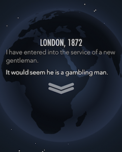
Inkle's 80 Days is a steampunk retelling of Jules Verne's Around the World in Eighty Days. Phileas Fogg has placed a bet that he can circumnavigate the world in only 80 days. He sets off with his French valet Passepartout, first crossing the Channel in a submersible train and then continuing the journey in various mechanical contraptions.

What's impressive about 80 Days is that it has a "real" game mechanic in addition to the literary side, without compromising either. You can play it strategically and ignore the prose, or read it as a story and ignore the game, or anything in between. It's easy to see why it's been succesful with so many different types of players.

It is visually gorgeous, both in its illustrations and typography; the music evokes an atmosphere of travel and adventure. The writing is sublime and only becomes awkward in the segments with canned default responses. The gameplay suits mobile gaming perfectly: it's easy to pick up and play any duration at a time.

Apparently 80 Days started out as a small side project to their Sorcery! series but the scope soon got out ouf hand. As such it's also a testament to how small side projects can grow to become something truly great.

Game of the Year first runner-up: Hearthstone
Hearthstone card Archmage Antonidas

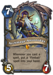
Measured by hours played this one would easily take the top spot of 2014. Hearthstone is a digital multiplayer trading card game in the style of Magic: The Gathering. The difference between Hearthstone and M:TG is that the latter is great fun played with physical cards but fails utterly as a computer game. Most of its gameplay consist of waiting for phase timers to run out which slows the tempo to a crawl.

Hearthstone however is free from baggage of the physical world. It's fast-paced and well balanced: the leveling system makes sure you always get opponents that are generally at your skill level.

Hearthstone's free-to-play system deserves a special mention. Winning matches earns you gold which you can use to buy additional cards, enter arena tournaments, and buy single-player campaigns. The prices are low enough that getting everything you need just by playing is feasible, there's no double economy where some things must be bought with special tokens that in practice cost real money, and those who do choose to spend real money aren't given an unfair edge over those who don't. People, this is how you do free-to-play right.

Game of the Year second runner-up: Hadean Lands
hadeanlands

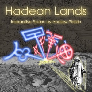
Andrew Plotkin's Hadean Lands is the result of a Kickstarter from five years ago. The style is unmistakably Plotkin; anyone who has enjoyed his previous games should feel right at home.

One of the more clever design decisions of Hadean Lands is how it manages to both include and subvert the difficulty level of Infocom-era IF. In the early days of adventure gaming a misstep could bring the game to a deadlock and the player was supposed to restart and replay several times to solve the puzzles. Hadean Lands also requires replaying but with "soft" restarts that keep information from previous playthroughs.

Book of the Year: S.

S. (photo credit: Casey Fiesler)

S. is written by Doug Dorst and J. J. Abrams, the latter being better known from his TV and movie work.

S. comes in a package that contains a book titled Ship of Theseus by "V. M. Straka". In the book's margins two college students have written correspondence to each other. In addition to these scribblings, between the pages there are newspaper clippings, letters, pages from notebooks, postcards and other "feelies". S. is not the book itself but the entirety of these three elements (the book, the footnotes and the feelies).

The "found footage" angle brings a whole new dimension to the reading experience. It's not possible to read S. like you would normally read a book (unless you purposefully ignore everything except the printed text of Ship of Theseus) which makes it kind of hard to place on the static <–> interactive continuum.

(Technically S. was published in 2013, but that's close enough.)

Movie of the Year: Interstellar
Interstellar poster

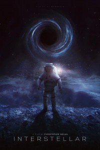
Interstellar is Christopher Nolan's sci-fi film about humanity's search of a new home when plant diseases are about to destroy Earth's capability to grow food.

Typical of Nolan's work the film takes one or two themes and builds everything else around them. What the theme is is always debatable but to me it was loneliness: personal loneliness and the loneliness of humans as a species. Also, a constantly recurring motif to look for: rotation and rotating things.

The movie is evocative and thought-provoking; I only wish that they had toned down the "power of love" angle a bit. In many ways it's the modern 2001: A Space Odyssey.

Blog of the Year: These Heterogenous Tasks

These Heterogenous Tasks

Sam Kabo Ashwell reviews various IF and almost-IF games at These Heterogenous Tasks.

The reviews are exceptional in that Sam not only reviews the games as they are but sees them in a wider perspective in game and narrative design. Often he uses the game in question only as a lens through which to inspect the bigger picture or a common trope in all game design.

This approach is both interesting to the reader and fair to the reviewed game. No-one and nothing exists in a vacuum, which is something that's easily forgotten. By placing the design decisions in context the discussion shifts away from picking on an individual designer's choices and towards a more general inspection of what works and what doesn't.

Competition of the Year: 20th Annual Interactive Fiction Competition

IFComp logo

The torch for organizing the Interactive Fiction Competition was passed to Jason McIntosh who not only took the responsibility but completely revised the web site and started to modernize the entire competition. The quantity and quality of entries went up and the event attracted a good amount of attention and reviews.

IFComp once eclipsed everything else that was happening in the IF world; now it's still the main event but the focus has evened out to other events and splinter communities. With the reformations taking place there's still a good chance that IFComp has value in the future as well.

Collaboration of the Year: ESA comet lander

Photo credit: ESA

The European Space Agency ESA's Rosetta spacecraft reached the comet 67P, and sent the Philae lander to its surface. Rosetta became the first spacecraft to orbit a comet, and Philae the first man-made object to land softly (as opposed to just crashing) on one.

While the mission is a technological marvel, it's also a collaboration of 20 European nations. That's 20 countries and cultures working together towards a common goal – an example to humanity that must ultimately learn to do the same in many other things.


The year 2014 saw some excellent content, the ones above and much more that could have been mentioned. Now we'll move on to 2015 and perhaps to even bigger and better things.

IFComp 2009: Correlation between rating and the number of testers

Everybody's always talking about how important it is to have your game tested (or at least I'm always talking about it). But does it really matter? Surely if you have a great idea and enough enthusiasm you can do without?
Continue reading "IFComp 2009: Correlation between rating and the number of testers"